Mimo Doce: Digitizing an Artisanal Confectionery
A delivery app that replaces slow, message-based ordering with a fast, self-serve experience — built around a custom "Build Your Kit" tool for party orders.
The Problem
Orders came in through WhatsApp — slow, error-prone, and dependent on someone being available to reply in real time. Complex requests, like custom party kits, were the hardest to get right.
The Solution
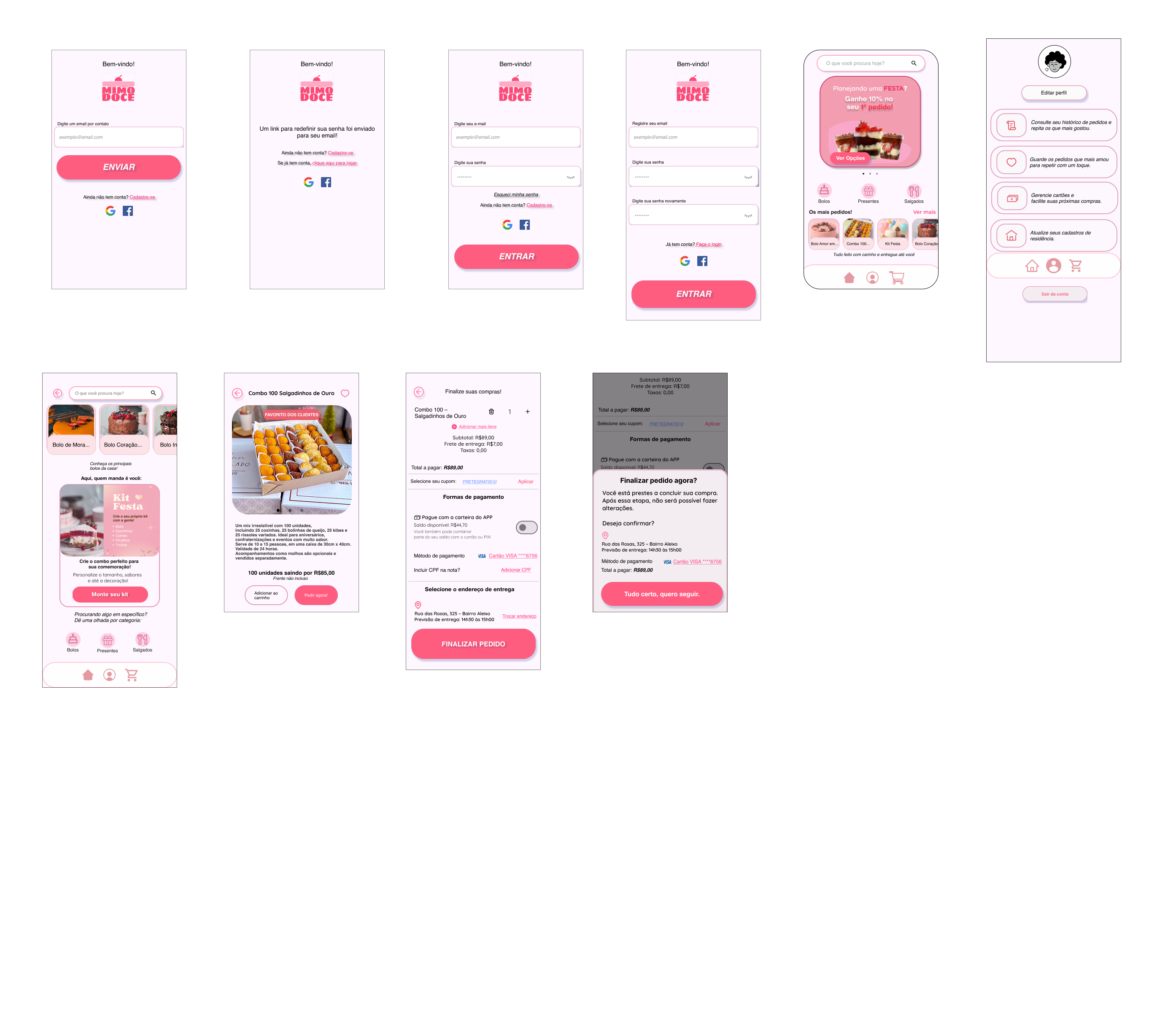
Mimo Doce replaces the message thread with an interactive catalog and a dedicated "Build Your Kit" tool, so users configure custom orders without waiting on a human response. Navigation follows patterns already familiar from major delivery apps — no learning curve, for any age group.
Visual Identity & Structure
The brand needed to expand digitally without losing its handmade warmth — welcoming and humanized, but modern enough to scale. Primary Pink (#FE4977) drives every CTA; Dark Brown (#420C2B) holds text and contrast against soft pink backgrounds, with rounded, 2px-stroke icons throughout. Information architecture and a 4-column grid were locked in at mid-fidelity — cart flow, checkout, and navigation — before any brand styling landed on top.
Designed Around Real Habits
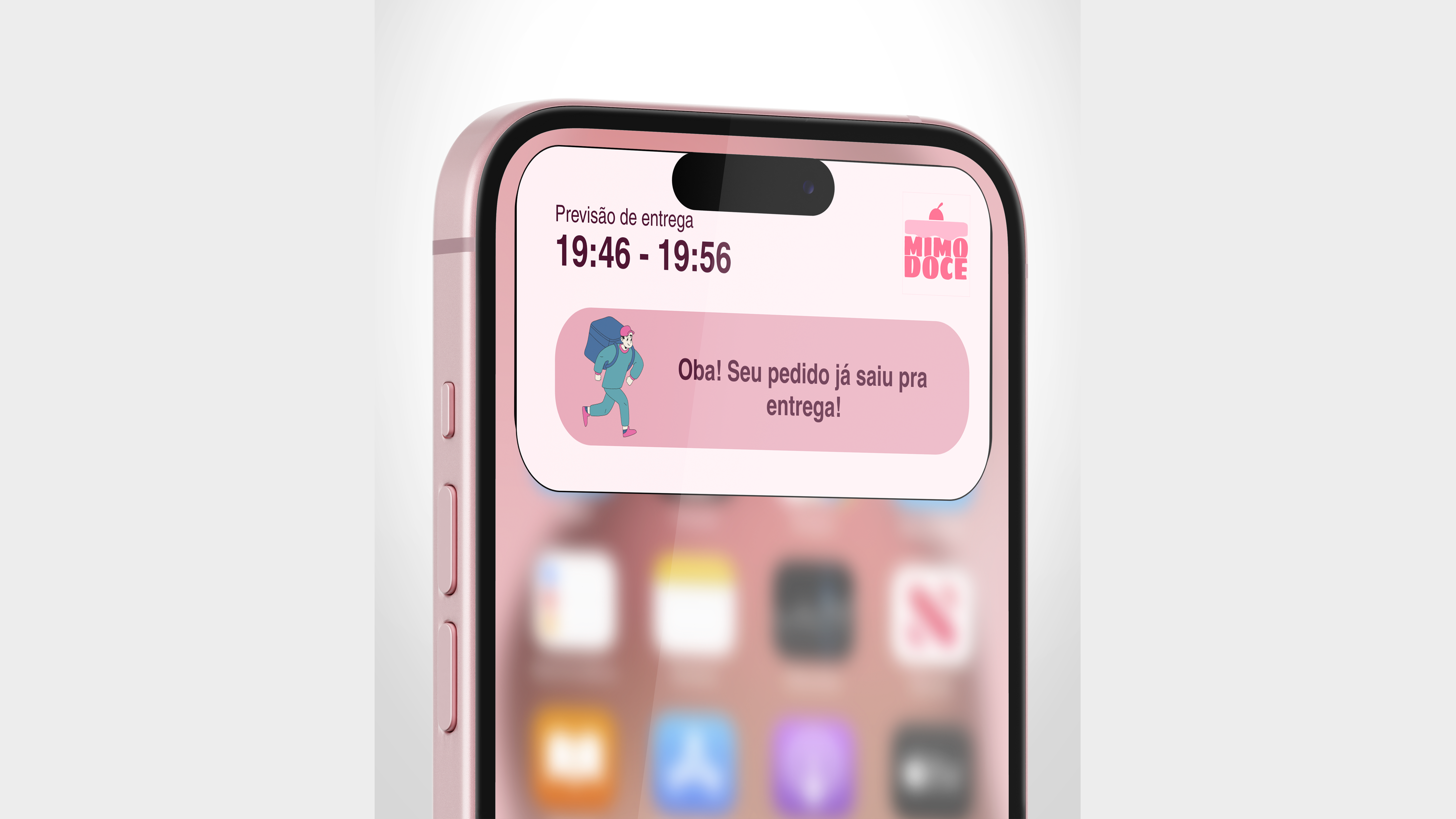
Three recurring needs shaped the flow: one-tap reordering for regulars, real-time delivery tracking to remove order anxiety, and a guided kit builder for first-time party planners.
The User Experience
To validate the user flow and core mechanics, the Figma prototype was tested with classmates matching the app's target personas — walking through browsing, kit-building, and checkout end to end.
Session recordings aren't shown here for participant privacy.
The Result
Mimo Doce started as a challenge and turned into one of the projects I learned the most from — not just in UI or UX skills, but in how design actually talks to the business behind it: retention, order friction, and where a "nice screen" stops mattering if it doesn't move the numbers.
There's a lot I'd do differently today. The "Build Your Kit" flow is a good example — great idea, questionable execution. It works, but it deserved a lot more testing and iteration than it got, especially given how central it was to the whole product.
Even so, it stays in my portfolio on purpose. It's less a finished product and more a record of the process — researching, presenting, defending decisions in group critique, being wrong more than once. That process is what actually moved my work forward, and that's why it's still here.