Aura Finance: A Crypto Wallet Redesigned for Retention
A self-initiated case study fixing engagement bottlenecks in a crypto wallet — redesigned around interactivity, speed, and motion.
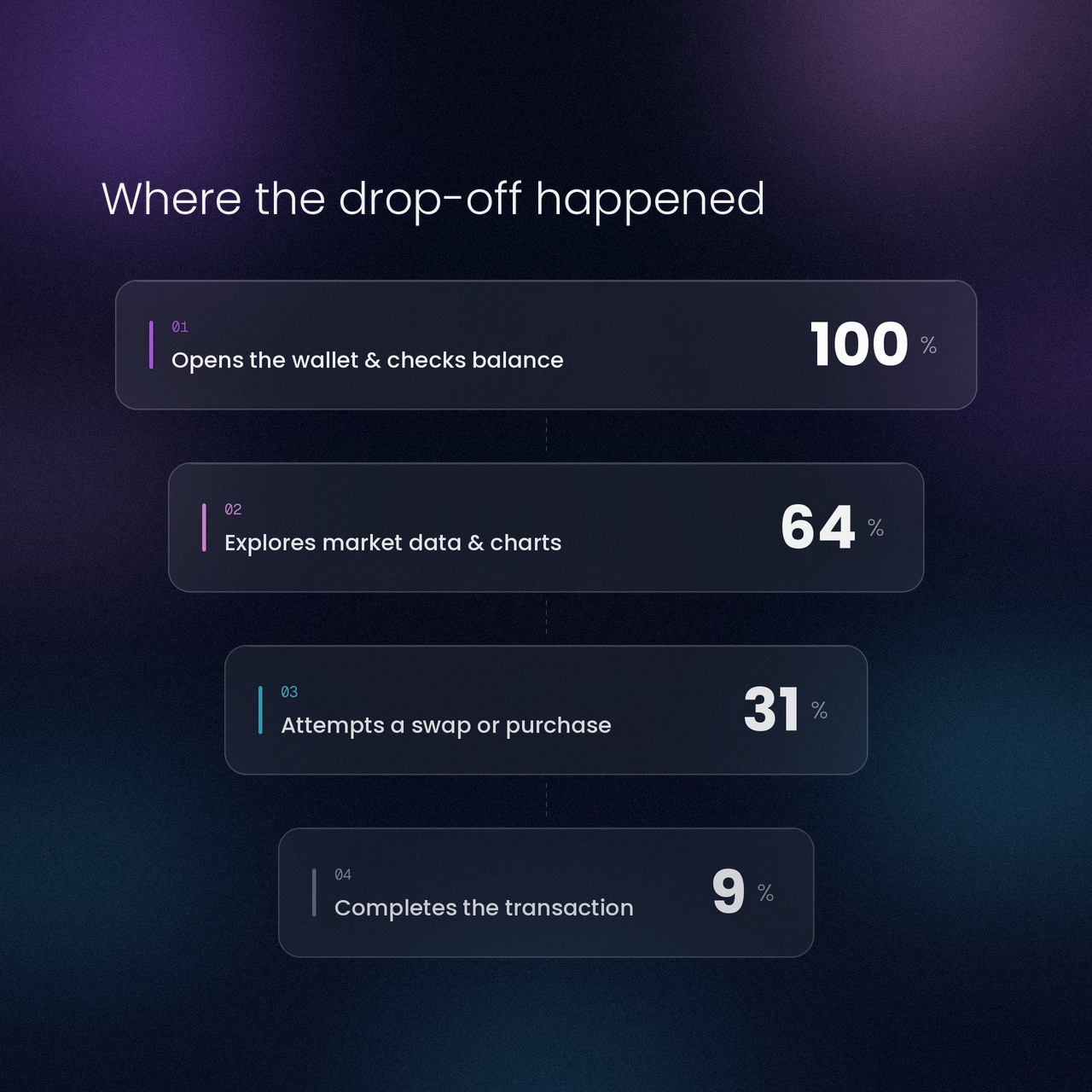
The Problem
Users opened the wallet, checked their balance, and left. Friction in buying, swapping tokens, and reading real-time charts kept people from transacting — and stalled the product's revenue.
The Solution
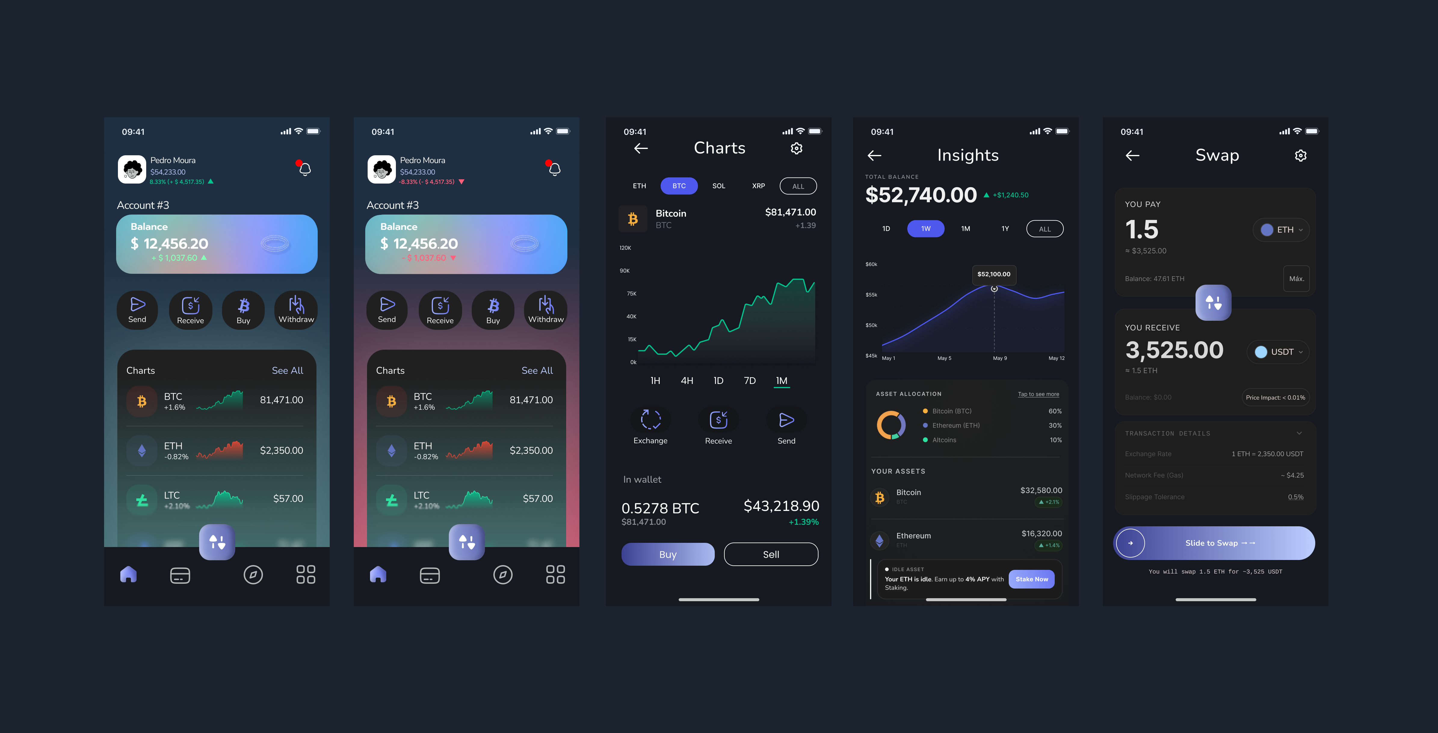
The home screen was rebuilt around one signal: balance shifts green or red based on performance, pulling users back toward the data instead of away from it. Insight tables and live charts sit front and center, and the menu is built to nudge swaps and surface the market's most active tokens.
Onboarding Without Friction
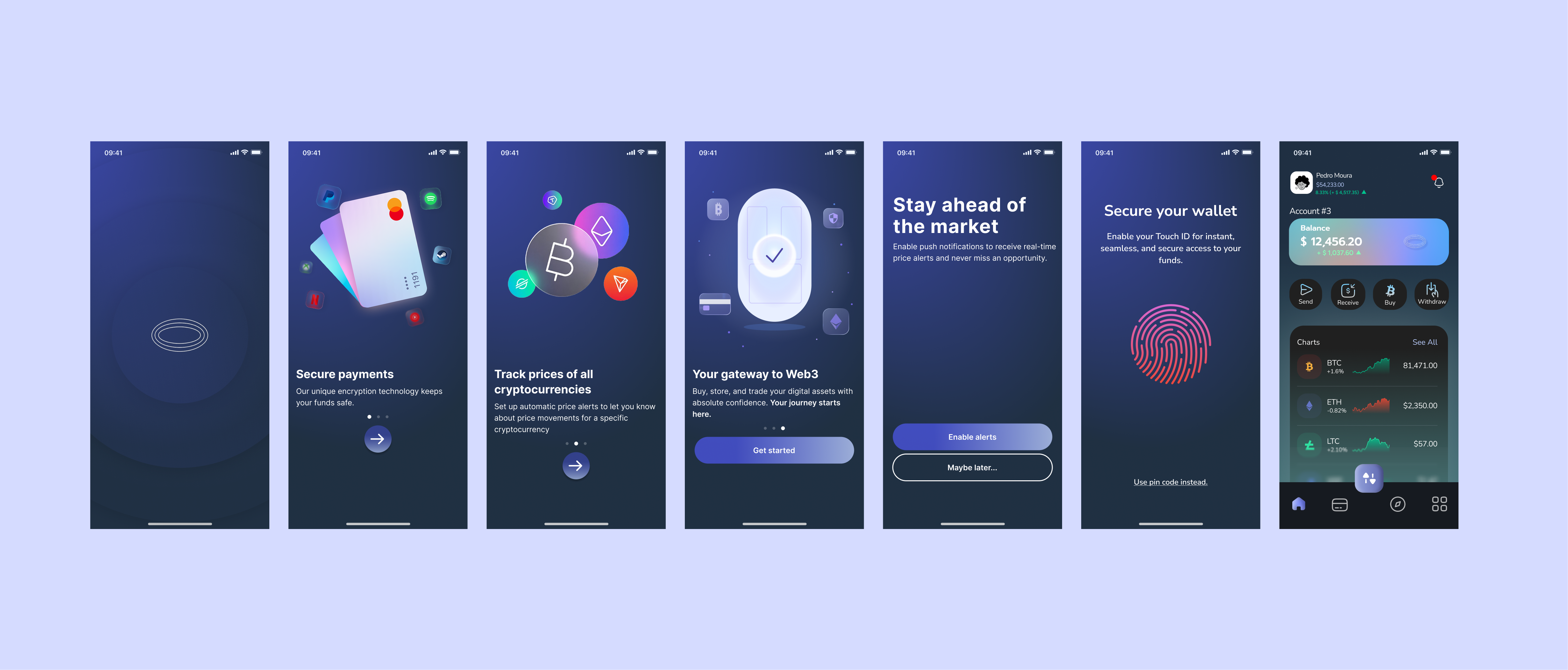
Account setup no longer gates the experience. Users land inside the app and start exploring immediately — matching the speed expected from crypto trading.
Motion as Interaction
Micro-interactions animate throughout the interface, reinforcing every tap and state change to keep the app feeling responsive and alive.
Grounded in Research
Design decisions were shaped by user behavior research and benchmarked against category leaders like Phantom and MetaMask.
Hero Video
A product film in the spirit of Apple and Google launch videos — modern, digital, and dynamic, built to carry the same intuitive energy as the app itself.
Where It Stands
The hero video is still in production, so the real result here isn't a finished film — it's what designing UI for a crypto wallet actually taught me about the category.
The interface was grounded in my own experience using crypto wallets, benchmarked against how Phantom and MetaMask handle the same flow problems. The goal was an interface that stayed direct and intuitive without losing its "web3" identity — close enough to the category to feel native, but not so stylized that it worked against the UX.
Motion became a core part of that decision. After studying how InfinitePay uses premium micro-interactions, I noticed how much perceived value that adds organically — not as decoration, but as a signal of quality baked into the experience itself.
Every element on screen was built with a reason: how a user would react to it, and how established wallets already solve for it. That reasoning was tested, not assumed — usability sessions with people close to me shaped several wireframe iterations before the final UI was locked.
The bigger takeaway: an app's aesthetic has to earn its place without getting in the user's way. That's not just a design problem — it's a business one, and this project is where I started treating it as such.