Creatwave: The Creative Ecosystem
A social platform built for creatives — designed to feel as fluid and dynamic as the work it showcases.
Reading the Market
A competitive analysis of Behance, Dribbble, Instagram, and X revealed a polarized landscape: platforms either felt overly corporate or visually oversaturated. The opportunity was clear — a space that felt sophisticated, fluid, and built for collaboration had yet to exist.
Choosing the Right Direction
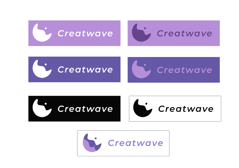
The symbol abstractly reinterprets the initials 'C' and 'W'. The circular form references global connection; the negative space suggests an explosion — creativity propagating outward. Engineered for legibility at every scale, from app icon to billboard.
A Palette Built on Intention
Lavender Purple was chosen not for aesthetics alone, but for strategic differentiation. Where competitors defaulted to corporate blues and saturated gradients, Creatwave claims a tone that signals creativity, sophistication, and harmonic energy.
- Lavender#B68FD8
- Deep Purple#65448C
- Carbon#070707
- White#FFFFFF
Structure Before Style
Fluid UI micro-interactions elevate the platform's sophisticated minimalism, while the dynamic branding video transforms the core "creative explosion" concept into a living, high-impact digital ecosystem.
A Brand in Motion
The branding film translates the core "creative explosion" concept into movement — the symbol unfolding, propagating, coming alive. It's the identity at full volume: fluid, energetic, and unmistakably built for a platform where creative work is the product.
The Result
Creatwave's identity now carries its "creative explosion" concept through every layer — from the symbol to the smallest UI micro-interaction — proving that fluidity can scale from an app icon to a full campaign without losing coherence. Beyond the deliverables, this project sharpened how I translate an abstract feeling into a disciplined, systemized visual language.